I enjoy creating user-friendly designs which compliment a client’s brand and values. Designing new interfaces for websites and mobile applications involves lots of iterations and client meetings but is immensely rewarding allowing me to express myself creatively every day and help clients communicate to their users / customers uniquely.
The Client:
TheGivingMachine is a registered charity that enables online shoppers to support a wide array of causes within the UK (e.g. schools, charities and a whole host of community groups). Shoppers can raise free donations for their chosen causes whilst they shop online – donations are generated via affiliate marketing raising commissions which are then donated to registered shopper’s chosen causes.
TheGivingMachine Team are a genuinely lovely bunch. Their passion to restore a sense of giving and community is so refreshing in the divided times we live in as of late. Basically, you’d want them to be your neighbours as I imagine they’re the type of people that are always going to have the correct bins out and they’d never take your parking space without asking first. A thoroughly awesome group!
Their Goals:
TheGivingMachine’s primary aim was to increase their conversion percentage of new shoppers (‘Givers’) signing up via their website. In order to achieve this, they wanted to improve and simplify the overall user journey for new visitors without alienating their existing users. TheGivingMachine needed to work within strict budget limitations, so our remit was limited to working within the existing site and its current technical implementation.
The Problem:
The problem is that the business has grown significantly and become more successful. But, how is success and growth a problem? It’s a significant problem when your website has not moved as quickly as your growth has and may not reflect the business and user needs effectively. The danger is alienating new traffic flow to the site with a look and feel that maybe isn’t quite reflecting the current business focus and goals. It’s also important to consider the negative impact this can also have on the engagement of existing users too. Returning, loyal visitors thrive on revived and engaging content to keep them interested and motivated.
The Solution:
A re-fresh of the onboarding journey is the solution for the TheGivingMachine to achieve their goals of increasing their conversion percentage. The main benefits of this approach is that it is within their budget, it’s quicker and a more efficient option than to re-build elements of the site from the ground up (which really isn’t necessary in this case). Re-skinning allows the TheGivingMachine to accurately reflect the progression of their business by enhancing user experience and strengthening engagement with regular users.
The Process:
There are many ways to start a new project (UX Workshops, usability testing sessions, etc) every client is different, and what’s right for one may not be right for another. The correct start for this project was a lovely day spent with the CEO, Deputy and CTO giving me a masterclass in all things TheGivingMachine (e.g. user journey flows, terminology, company values and goals, etc). The Team were very keen not to influence my opinion of their website as they wanted to empower me with the freedom to make changes without having to implement their personal preferences (FYI: this fantastic decision of theirs also guaranteed them top spot on my Christmas card list!). Once the key stakeholder meeting was complete, and I was made fully aware of the technical limitations they have, I was then free to create my recommendations for the re-skin. So, consider me to be the UX equivalent of Marie Kondo (only with far less poise and serenity and far more swearing and terrible jokes), and I will redesign your existing website decluttering it of anything that doesn’t “spark joy”.
The Wireframes (aka “the fun bit”)
Humans are visual creatures and having clear side-by-side comparisons is a must, and it’s the best way to initiate the right conversations to progress projects further. Ultimately, everyone has an opinion on a visual, and it’s safe to say that their opinion is either going to inflate or deflate my ego. And truth be told, neither of those outcomes are a good look for me, but that’s not for the client to worry about…that’s only a concern for my long-suffering Code Wizards colleagues!
In this section, I am going to talk you through the initial wireframes that I pitched to TheGivingMachine. My approach is to highlight issues that may prevent them from achieving their aims (primarily to increase their conversion rate) and provide them with a solution that fits within their technical restrictions (FYI: Code Wizards were only asked to provide TheGivingMachine with wireframe solutions – the implementation-side of the re-skin was in the hands of the their own IT people).
Existing Homepage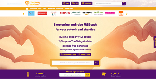
Overall, the existing homepage lacks clear direction. It’s not prioritising how the user should review the information on screen. There is unfamiliar terminology in use. All the CTA’s look the same. The branding is almost used apologetically.
Proposed New Homepage
My intention was to simplify the home screen by reducing the amount of information that is on display and empower it with a stronger sense branding and direction. The layout is the same - partly due to technical restrictions and partly to maintain familiarity for existing users. Often when users land on a site they are arriving with a specific task in mind; therefore I wanted it to cater for all the different users efficiently and ensure that the sites purpose and content are as clear as possible. If studies have proved that users have a tunnel vision to complete their task, then they’re simply not going to hang around. I tried to use the homepage to guide users on their way not educate them on all things TheGivingMachine.
The user is welcomed with a nice 3 step ‘how to’ guide with the unfamiliar terminology removed. The sentences are succinct as people do not tend to read; they simply scan, looking for keywords. I’ve tried to optimise The Guttenberg Rule here (it demonstrates a user behaviour known as ‘Reading Gravity,’ e.g. the western habit of reading left-to-right and top-to-bottom) by placing important text in a location which naturally falls in the users primary and strong optical areas when scanning the screen. However, new users wishing to discover more detailed explanations can be redirected simply by the introduction of the 3 new sections underneath the banner. In short, the information is available to those who want it, and it’s not distracting for those who don’t.
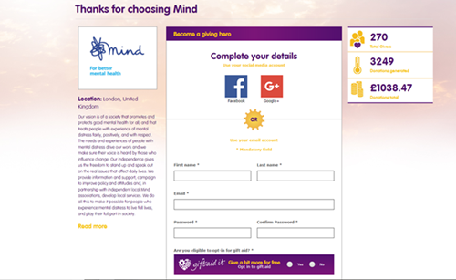
TheGivingMachine informed me that their existing users were predominantly parents (of children attending primary school) who are trying to help fund school projects, and this is why I felt this particular image would be relevant. The primary CTA’s are purple and more prominent (aimed the new users). The secondary CTA’s are white, and less prominent (aimed at existing users hence the advantage of maintaining the same location as before).
Existing Choosing a Cause Screen
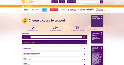
It’s not easy for the user to review the causes at a glance; instead, they are having to interact with an accordion feature to learn more about the cause. Accordion features are great but can become quite messy quite quickly. There are no CTA’s displayed to confirm the user’s selection without interacting with the accordion feature. The search field does not imply what the user can search by (e.g. location, category, cause sign up code, etc.). The FAQ’s located on the right of the screen feel really out of place on this screen.
Proposed new Choosing a Cause Screen (Step 1)
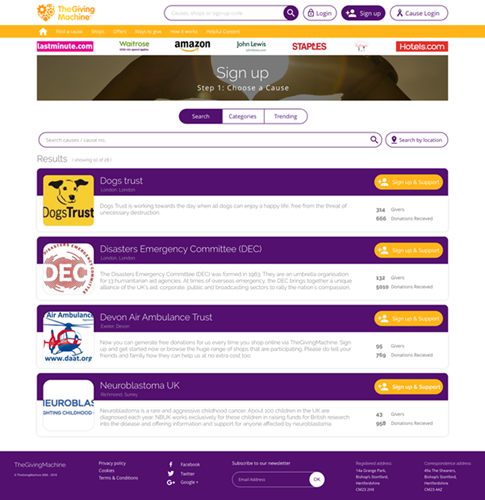
Again, my intention is to simplify the users experience and ease of use. The user is informed that this is stage 1 of the 3 step sign up process that was introduced on the home screen. Conscientiousness is important in design and respecting the fact that users are busy and reassuring them that they are not about to face a time-consuming registration process will strongly assist in minimising any potential new user drop-off rates at this crucial stage.
Users can review causes via search, categories or trending. This will help spark inspiration for those who may feel a bit overwhelmed or help those who know exactly what they are looking for as quickly as possible.
The search bar informs the user exactly how they can search; cause name, cause number or via location. Even if the user’s location settings are switched off, this still indicates they can manually search their home town (if they wish).
Results are displayed with the Cause logo being most prominent – again another easier way for the user to search and is far more attention-grabbing. A synopsis of the cause is also displayed and a prominent ‘sign up and support’ CTA. I also added some interesting stats (giver total and total donations received) as I felt it would assist new users becoming familiar with TheGivingMachine terminology as well as creating the sense of ‘on-line community’.
Existing New Giver Details Screen
On the above example, we can see the user has selected a cause to support and further information about this cause is then offered; however, this information is then separated either side of the screen. The user is not being directed clearly on the priority order of the screen.
Proposed new Giver Details Screen (Step 2) 
This screen follows as soon as the user has selected a ‘sign-up & support’ CTA on the previous screen. The user is made aware that they are now on stage 2 of the process, clear confirmation is displayed of the cause they have chosen, and they are swiftly prompted to complete their details. In order to guide the user more effectively, I have opted to divide the screen up; cause choice, sign up via social media and sign-up manually.
Cause Confirmation Section:
A nice easy visual is displayed with their chosen causes’ name and logo. A ‘thank you’ is offered in an attempt to humanise the experience. I’ve recommended that only a minimal description is used as duplicating information always feels a bit tedious. I thought this would also be great opportunity to promote similar, lesser-known charities too, e.g. A renowned animal charity linked with lesser-known animal charities that might be desperate for the support and exposure.
Complete Your Details Sections:
Nice and convenient sign-up via Facebook or google for those of us who prefer this simpler method. The difference here is I have made the options look more like CTA’s rather than just their logos as I feel this is more in-keeping with how I’ve designed the journey so far.
Old-school manual sign-up is just cleaner and more brand-happy. I have suggested that TheGivingMachine use a radio button for the gift aid option which is switched to ‘yes’ by default because they’re a charity and it’s free!
Clear T&C’s confirmation and Sign Up CTA.
Existing Registration Complete Screen
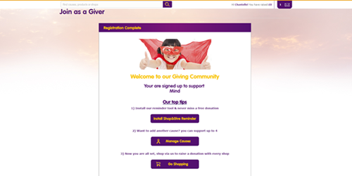
The registration complete screen is displayed in a stacked style, which frankly could be a bit prettier. Studies indicate that people do not tend to read; instead, they scan, so making the screen layout more visually appealing will assist with ensuring that the user actually reads the tips on what to do next.
Proposed new Registration Complete Screen (Step 3)
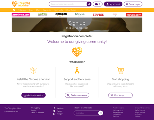
This is the final stage in the sign-up process, and the intention here was to make the screen more visually pleasing. Space is utilised more effectively without feeling too cluttered. I wanted to continue to familiarise the user with branding and icons, e.g. use of the brand logo, purple text to welcome users to the community, yellow icons which are repeatedly displayed around the website, etc. The aim is to get the user-inspired enough to install the chrome extension, support more causes or start raising funds for their new cause. Statistically, web users spend 69% of their time viewing the left half of screens (if you consider The Guttenberg Rule that I mentioned earlier which is based on westerners reading from left to right) therefore, my layout suggests the user is visually more drawn to installing the chrome extension for their browser. This would be the preferred next step for TheGivingMachine as this would prompt the user whenever they shop online.
Conclusion
The process of understanding TheGivingMachine and the needs of their users was an exciting journey which resulted in a wealth of ideas of how we could reflect their brand and increase their conversion rate. However, it can be frustrating if some of those ideas are not compatible with the existing technical framework and an extremely limited budget. In this scenario, it’s important to channel your inner Bear Grylls and “improvise, adapt and overcome”. TheGivingMachine have since implemented the new Home Screen and Confirmation Screens designs, and they are hopeful to implement further changes in the future (should their budget allow it).
The opportunity to work with a team that are so passionate about what they do is nothing but a privilege, and it’s such a compliment when they respond to my ideas with such enthusiasm and positivity. They’re a fantastic charity, so if you get the chance, please check them out https://www.thegivingmachine.co.uk/ as they make such difference to local and national causes. They also sell Corporate Giving Vouchers https://www.thegivingmachine.co.uk/giving-vouchers/, which are great incentives for your Team.
About the author

Chantelle Fitzgerald
comments powered by Disqus
We're Honestly Here to Help!
Get in Touch
Got questions? We're always happy to (at least) try and help. Give us a call, email, tweet, FB post or just shout if you have questions.
Code Wizards were very efficient and transparent. It was a pleasure working with them as they brought valuable advice, insight and development to achieve our project's success.
Daniel Ross, Head of IT and Development, 52 Entertainment / Virtual Regatta
Code Wizards are a pleasure to work with.
Richard Corps, Serial Entrepreneur and Augmented Reality Expert
We've challenged their team to integrate our cutting edge AI, AR and VR solutions and always come up trumps.
I love their approach and help on strategy.
Working In Partnership
We're up for (almost) anything.
We believe that life is better in co-op (and if we can't help then we probably know somebody else that we can direct you to). Get in touch.